Tips for an Effective Landing Page and Product Descriptions
An effective landing page is important. While technology has transformed business — and there are now many businesses that exist solely in the digital space, some things never change. Once a potential customer arrives, the goal is to have that person make a purchase before they leave. If we put this into fast food terms, […]
Project Tips and Tricks
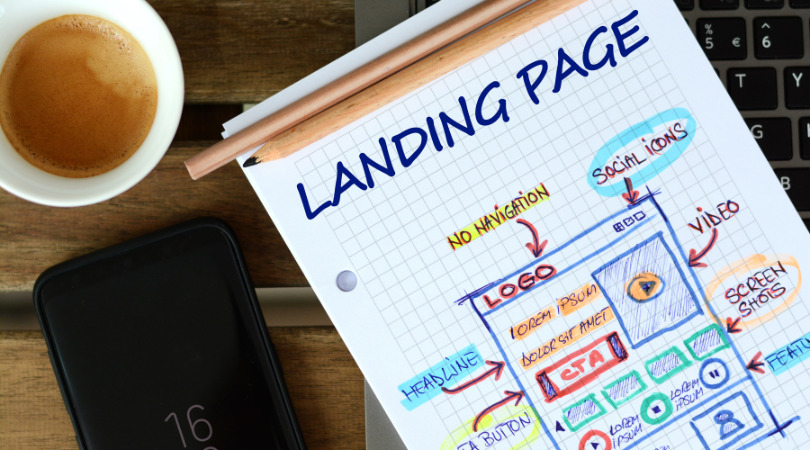
An effective landing page is important. While technology has transformed business — and there are now many businesses that exist solely in the digital space, some things never change. Once a potential customer arrives, the goal is to have that person make a purchase before they leave.
If we put this into fast food terms, we can imagine a fast food joint that sells hamburgers. The goal of the restaurateur is to have a lobby that welcomes guests into the store, has an easy to read and obvious menu, and not have those customers walk out without making a purchase.
Online, a landing page is the equivalent of a lobby. That means having an effective landing page can significantly increase both the number of
visitors to one’s website and interest in one’s offers. While having a great landing page is important, creating one takes some skill.
Here are some tips to achieve this result:
Define the main offer.
Your main offer should be clear and easily understood at a glance. Visitors should have their interest piqued and a desire to learn more. It might be tempting to put all one’s products on offer, but focus on one product or service that you want to promote. Users don’t want to play Sherlock Holmes to figure out what main product a landing page is promoting.
To put this into our earlier example, most fast food places have a primary food that they sell. Burgers, burritos, or chicken, the main food should be obvious. If it’s not, potential customers might get overwhelmed and confused by the myriad of choices and head to a restaurant with fewer — but easier — options.
Advantages over competitors
Create a list of real advantages that your product or service has over competitors. It can be the product’s uniqueness, better quality, better prices, faster delivery, etc. Present them in the format of short and concise points. Visitors should find it very easy to compare the product to competitors’ and see the benefits of yours.
One often sees this in fast food advertisements. A restaurant will promote their healthier options, their cheaper options, or their unique food. When a lot of restaurants are selling hamburgers, a restauranteur must let people know why eating his or her hamburgers is their best option.
Promotions and gifts
Include an exciting promotion or gift offer. This can encourage visitors to leave their contact information. For example, offer a discount on the first purchase or a free trial period for services. Contact information is valuable. While a visitor might not be ready to buy right then, they may be later.
Many restaurants offer apps that allow restauranteurs to push ads and track purchases. People allow this as these apps offer incentives like a free coffee after so many purchases or a random coupon for something free.
Product description
The product description is one of the most important elements of your landing page, as it helps potential customers understand what exactly you offer and why they should make a purchase.
Very few people will buy a product they don’t understand or think that they need. People go to restaurants for a few different reasons. They may go because they are hungry or thirsty, but they also might go if a particular advertised product looks desirable.
Whether one is selling a hamburger or a camera or a car, the product description needs to be done well.
The main elements of a product description are:

- The title should be:
- Clear and specific. It should clearly indicate the name of the product and its main advantage.
- Attractive. The title should make visitors want to know more.
- Example: “XYZ smartphone – The fastest processor with 108MP camera.”
- The short description should:
- Be brief: One or two sentences should give a general idea of the product.
- Highlight important characteristics: Decide on the most important features of the product and focus on them.
- Example: “XYZ smartphone with next-generation processor and 108MP ultra-sharp camera for perfect pictures.”
- The detailed description should include:
- Specifications. List the main specifications or features of the product.
- Benefits. Explain how these characteristics make your product better and the advantages they will bring to users.
- Example:
- Processor: Octa-core 3.2 GHz
- Camera: Main – 108MP, front – 32MP
- Display: 6.7 inches, AMOLED, 2400×1080
- Battery: 5000 mAh, 30W fast charging
- Memory: 8GB RAM, 128GB internal storage
- Image should be included and be:
- High quality. The photos of the product should be clear and professional. Fuzzy or low-quality images might leave users wondering if the product is similarly low-quality.
- Different angles: Show the product from all sides so that users are satisfied they have seen the product in its entirety.
- Contextual images: Show the product in use so users can visualize how the product will fit into their lives and benefit them personally.
- Video review (if possible):
- If a picture is worth a thousand words, how much is a moving picture worth? Including a short video that shows the product in action can greatly increase user engagement and allow them to quickly assess the product.
- Information about price and promotions:
- Include the price of the product and, if applicable, any current promotions or discounts.
- Add any other items that might entice buyers to make the purchase. Sharing installment options or offering free shipping might help a customer overcome possible hesitations.
- Call to action (CTA):
- Last, but not least, A “Buy Now” button, “Learn More” button, or other action button will encourage and make it easy for the user to buy or contact you. Once a user is ready, it should be quick, easy, and intuitive for them to be able to make the purchase.
By applying these tips, you can create an effective landing page that will attract more visitors and encourage them to take action.
At Swan Software Solutions, we create high-quality software, websites, and more to help our clients succeed. Contact us to find out more about how we could help your business.


